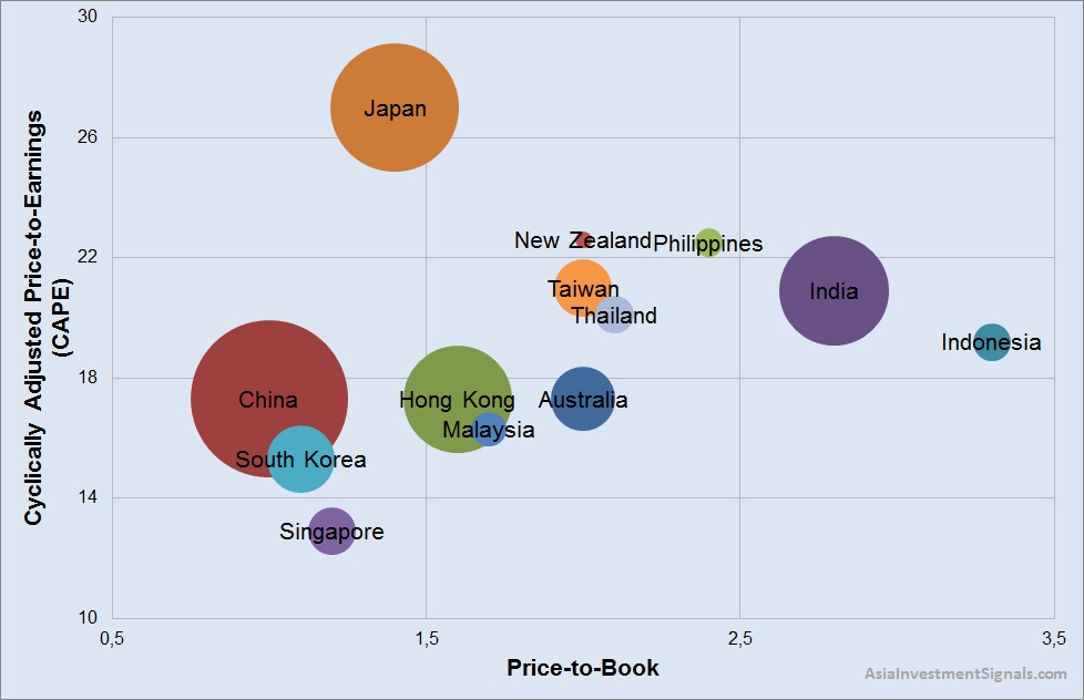
 Our graph shows the valuation map for the different stock markets in Asia Pacific. The vertical axis of the graph shows the CAPE ratio. The horizontal axis shows the price-to-book ratio. The size of the bubbles indicates the market capitalization in USD of each country.
Please login or purchase a membership to view full text.